Colour Palette
Our primary palette consists of our core brand colours, used across all of our collateral.
Make the most of our mark
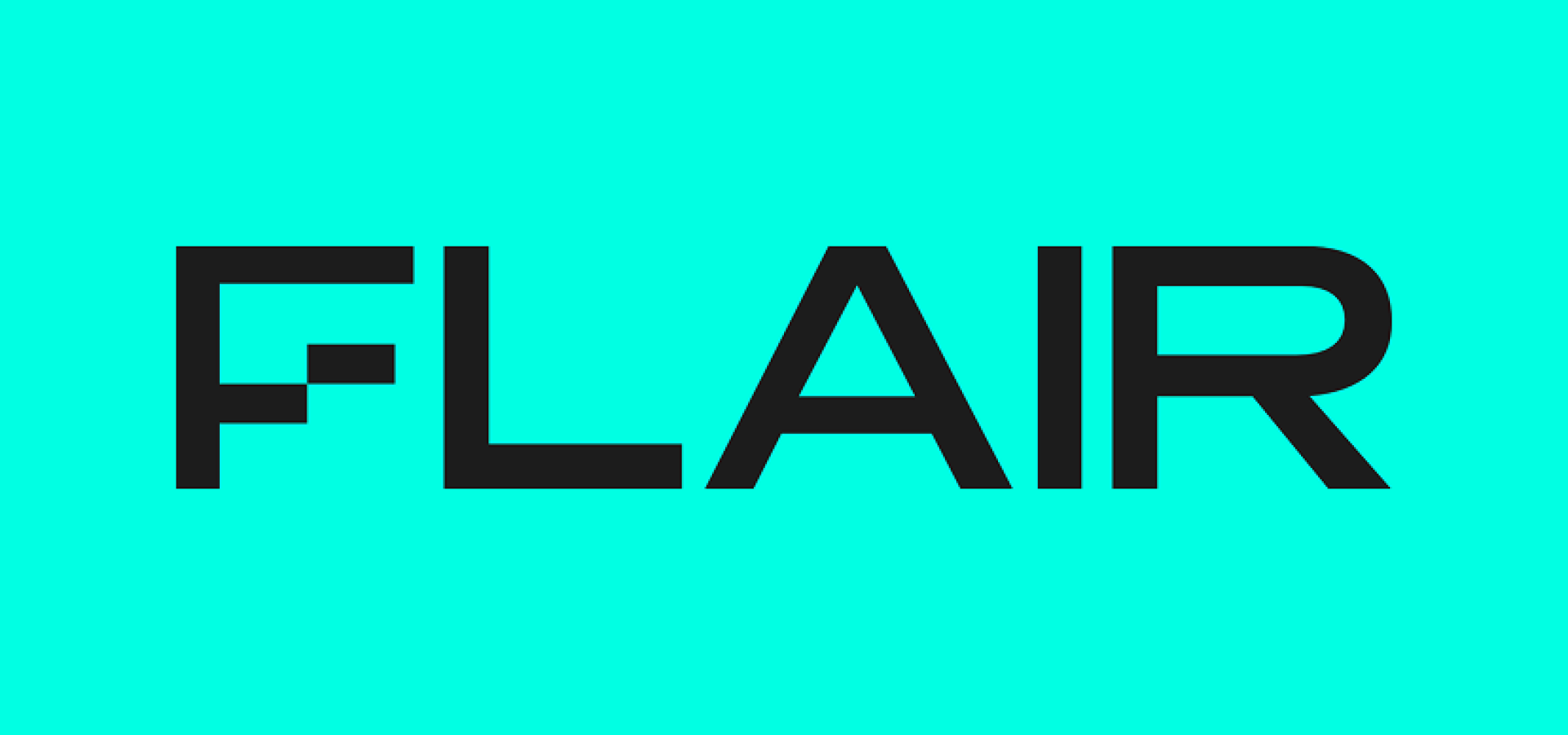
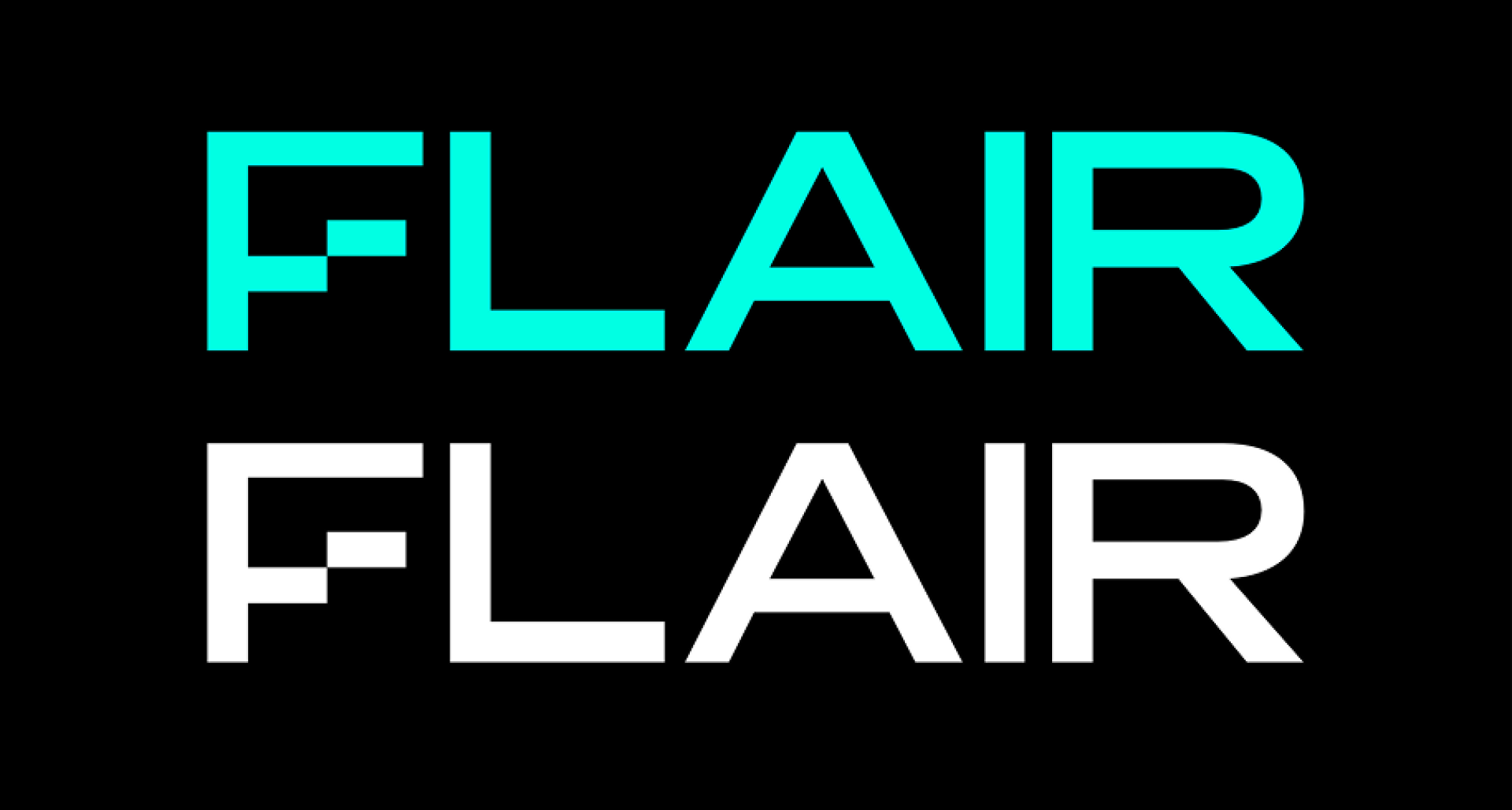
Our brand is more than a logo. But our logo is the key way we are identified and signifies what we stand for. This is our primary logo.
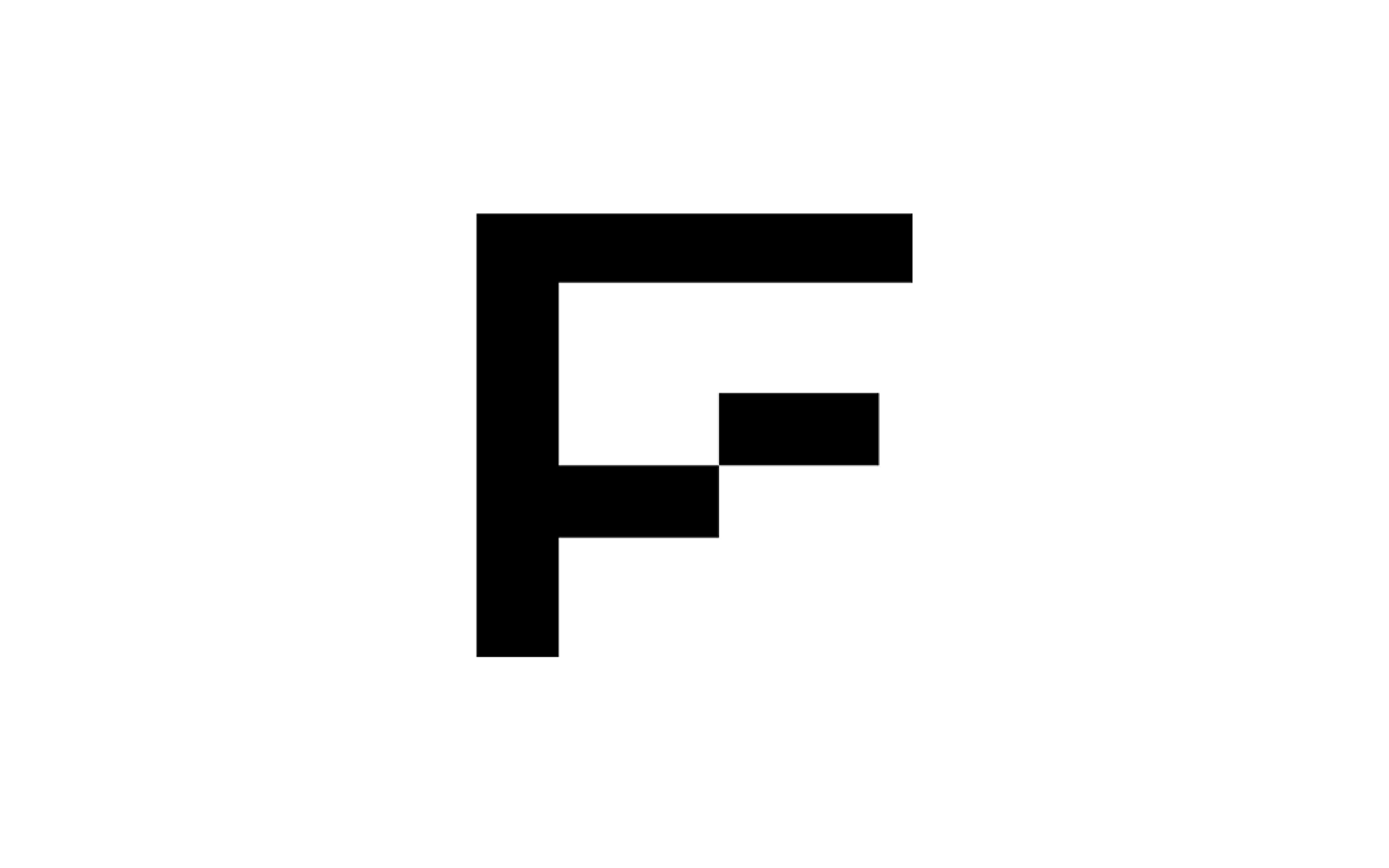
This is our logo mark. The mark is useful for specific instances with limited space such as social profile pictures, dashboard icons and page furniture. This may be used often as a shorthand identifier of our brand.
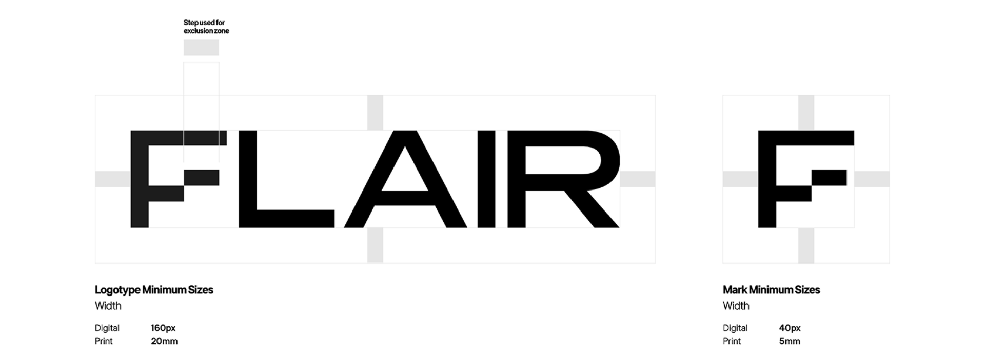
Our exclusion zone is created by using the ‘step’ from the logo. The zone should be the ‘step’s width.
This exclusion should then be applied around the whole of the logo as shown. Please make sure that no text or graphic elements enter this space.
We have multiple brand colours which are available in different shades. On the lighter shades, the logo should be used in black. When using the darker tones, the logo should be used in white or brand active blue.
Our primary palette consists of our core brand colours, used across all of our collateral.
Not all our colours work as well together so we’ve created this guide to show the good and bad combinations to use when creating for Flair.
Here is our lead font for the Flair brand. It offers impact and clarity whenever used.
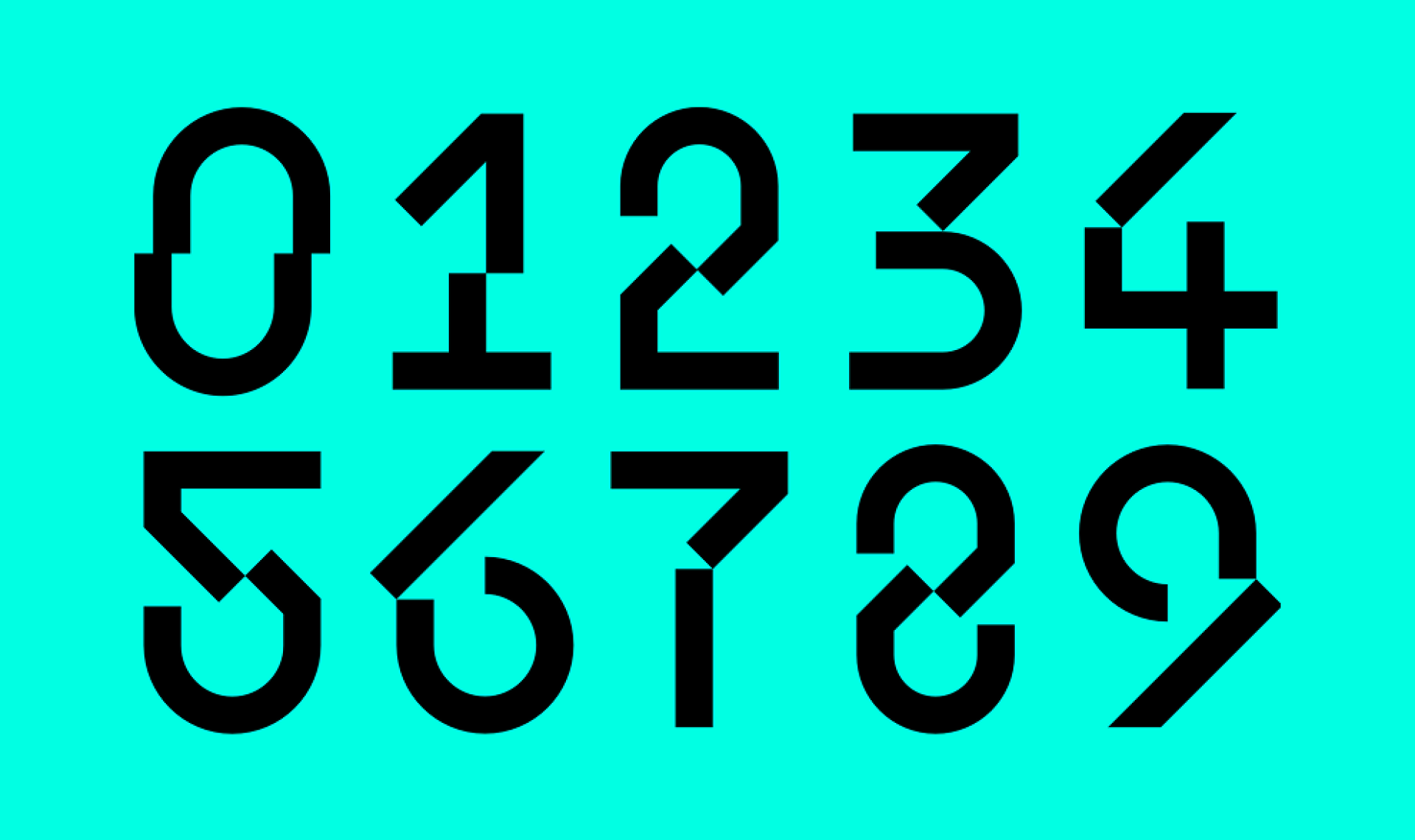
Here is a bespoke set of numbers. Whenever we show any numbers or statistics in our comms, we should use these numbers rather than those within our brand font set. You can review examples of these within in ‘brand in use’ section.
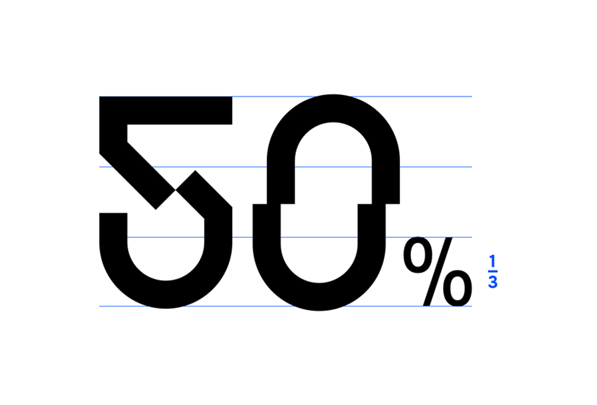
When using a percentage sign with the numbers, try to keep the percent symbol a third of the size of the accompanying numbers. This lets the numbers still be the hero of the statistic.